
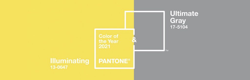
2021 Pantone Color of the Year
Here at Big Acrylic, we are VERY busy processing all of your holiday orders. But even business couldn’t stop my excitement of seeing Pantone unveiled their “2021 Pantone Color of the Year.” Each year, Pantone forecasts design trends in fashion, architecture, and graphic design by naming a specific shade they feel sums up the upcoming year. Such selections as “Living Coral” (2019) and “Rose Quartz” (2016) were extremely accurate. Designers created tons logos, branding, and filters with those colors in mind. What’s special about 2021 is that Pantone selected not one, but two colors!
The two colors selected happen to be my absolute favorite colors: a brilliant yellow (Illuminating) and a solid, light grey (Ultimate Gray). Pantone said these colors are a “marriage of color conveying a message of strength and hopefulness that is both enduring and uplifting.” Which is, of course, a beautiful sentiment to carry into the new year.
Tthe unveiling of the 2021 Pantone Color of the Year means that we can provide a whole slew of inspiration for your home decor. As we mentioned, the color of the year helps dictate the trends across a variety of artistic mediums, and home decor is definitely one of them!
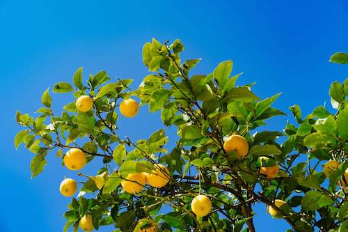
2021 Pantone Color of the Year: Illuminating
Our acrylic, metal, and fabric prints are already captivating. But the 2021 colors take it to an even higher level. “Illuminating” is a vibrant yellow. Printed on acrylic or sublimated metal, this color will pop. Illuminating is the hue of lemons, sunflowers, bananas, taxi cabs, egg yolks and more. When contrasted with a deeper, darker colors, Illuminating becomes an excellent anchor for decor that is meant to be vibrant, enthusiastic and calming.
So far, we’ve seen a few ideas shared over on Pantone’s Instagram page. The key to using Illuminating in home decor is to determine whether Illuminating is the main color, or an accent color.
“Illuminating” Print Ideas: Accent Color
So, you love the look of bright yellow, but think it may be too busy for your room. Thankfully, we have a great solution for you. Small prints, 8×10 in size, would be a perfect way to add that splash of yellow without full commitment. For example, surrounding a larger print that may be black and white, or grayscale with two small prints, each with a splash of yellow, would create excellent contrast on the wall. Using this bright yellow as an accent color also means that your small pieces, like cushions, throws, or knick-knacks unite the room when combined with wall decor.
The joy of using Illuminating as an accent color is the creative freedom. You can opt for a more minimalist style, like a linework lemon. Or you can go fully bold and brazen and create a large glass acrylic print of a sunflower field. For the most bold, you can even use Illuminating as a main color.
“Illuminating” as a Main Color
Choosing a bright yellow as your main color in your palette is certainly a bold choice. A bright yellow couch, or carpet, or bookshelf certainly focuses the eye. But that doesn’t mean your wall decor can’t compliment. While you certainly can choose wall decor that is softer, or minimal, you can also go the opposite route. As mentioned previously, Illuminating pairs well with deep navy, or other jewel tones. This bold style of decor will be energetic, busy, and enthusiastic. Making it a great combination in spaces where the goal is productivity and vibrance.
If you use Illuminating as a main color, your wall decor could feature some deep emerald banana leaves, or sapphire seas. Even red roses, or romantic purples and mauves could pair well with the yellow.
2021 Pantone Color of the Year: Ultimate Gray
Over the past few years, the use of gray has really gone up. And it’s selection by Pantone really reflects its popularity. It is the first neutral tone to be chosen by Pantone since they began selecting the color of the year in 2000. Ultimate Gray really is what its name suggests: a light-bodied neutral capable of pairing with just about anything.
Versatility is one of the hallmarks of this color. As a main color, it is calming and open to numerous renovations. With a gray couch, or bedspread, simply changing the throw pillows can revitalize the entire look and feel of a room. As an accent color, Ultimate Gray softens any tone it is paired with, making the room less busy, and more calming.
Ultimate Gray as the Ultimate Color
Either as an accent or as a main color, Ultimate Gray pairs well with natural textures. Especially in darker stains. Ultimate Gray could be an excellent replacement for the ivory or beige neutrals of trends past. It offers complexity without being too dark or too drab. When paired with cooler tones, the room will feel relaxing, perfect for a bedroom, office space, or bathroom. When paired with warm tones, like Illuminating, Ultimate Gray offers extraordinary energy and contrast, making it perfect for living rooms or dining rooms.
While our brushed metal prints might not be the exact shade of Ultimate Gray, they too provide the same effect as wall decor. Additionally, we are able to print any grayscale image on any one of our mediums, though we suggest going with acrylic if you want the image to have a sheen as well.
We hope that you enjoyed our blog this week and will think about the 2021 Pantone Color of the Year as you start your home redecorating projects! The New Year will bring lots of new ideas and new changes. Pantone seems to think that it will be a year of great illumination and balance! Let’s hope they are right!
As usual, though we are busy with our holiday orders, we are always available to contact. Don’t hesitate to reach out and let us help you start the new year with a fantastic new project.

